

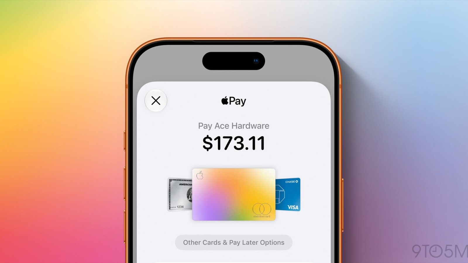
Apple Pay receives one of its most significant updates in years with iOS 27, headlined by a completely overhauled checkout flow that arrives as one of the service’s best improvements to date.
Apple Pay has grown into one of the most widely used payment methods worldwide. Its reach is now so broad that even Walmart added support for the service. With that level of adoption, any major change carries risk, particularly a redesign that touches millions of transactions.
A New Apple Pay Checkout Flow in iOS 27
In iOS 27, Apple Pay features a refreshed design when checking out in apps or on the web. The previous layout had two main shortcomings: switching between cards was not intuitive, and onscreen details were difficult to read at a glance.
The older method for changing cards often led users to tap near the active card at the top, only to be sent to the address screen instead of the card selection menu. iOS 27 addresses this directly.
When you open the new checkout interface, additional cards now appear on either side of your default card, signaling that you can swipe between them to switch. The result is faster and far more straightforward.
Clearer Information and Colorful Icons
iOS 27 also displays more information on a single screen and uses colorful icons to highlight relevant details such as shipping method, shipping address, and billing address. This makes it easier to confirm that everything is accurate before completing a purchase.
Once the details are verified, users can double-click to pay with added confidence that no errors are present. Redesigning a tool used by millions, where mistakes carry real-world consequences, is a considerable challenge, and the updated flow streamlines the entire process.
Availability
The redesigned Apple Pay checkout arrives as part of iOS 27, applying to purchases made within apps and across the web. The update improves both the card-switching experience and the clarity of transaction details shown during checkout.
Source
Image: 9to5mac.com